
drum
collab

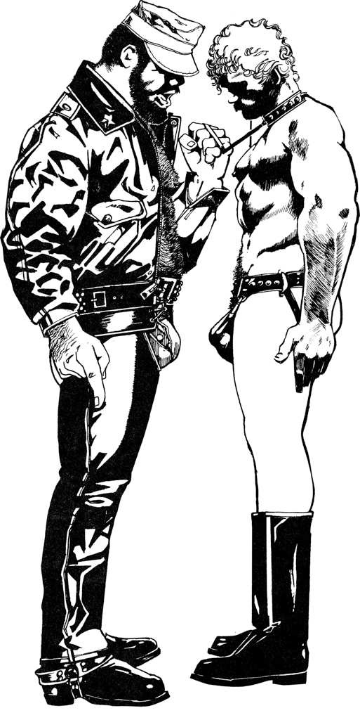
If you were to look only at “drum”, you might imagine that Bill Ward worked only in Black and White. Not the case. There were financial limitations on printing technology in the 70’s and 80’s which kept full-color printing out of reach of Drummer and associated magazines. Bill worked in color frequently, in painting, watercolor and gouache, pencil, and inks.

In the spirit of bringing Bill Ward’s work into the 21st century with this website and books, thought it might be valuable to have a “Bill Ward Collaboration” project hooking up his drum images up with contemporary (young) gay artists and have them re-think, re-interpret, and re-mix the images in completely new ways.
All my art collection mentors and colleagues were initially quite negative about the idea – for many men, Bill’s images are almost sacred, certainly often iconic and reworking them would be a corruption the images. But, trusting my taste and instincts, I worked with a small group of artists, not comic illustrators, and the output was amazing.
Even the toughest critics agreed that the outcome was, in many cases, spectacular. The original works were still great, and remained classic Bill Ward. The new works were not ‘better’, but clearly new works of art in their own right – fully respectful of Bill Ward and the idea of drum, the unbridled sexuality, and boundless sexual pleasure, but now the color gave a new kind of depth and detail, an interpretation of Bill’s art made visible. Here are some results.
David Maldonado
This example page done by Sacramento artist David Maldonado was a key image that quieted the critics. The new color image is not “better” than the original, but a different, exciting new work of art. It’s remarkably contemporary, with David’s choice of color palette, and color blocking, coming straight out of Manga… and not dramatically different from Bill’s early experiments with color with the comic strip “King” in Drummer.


-

Artist’s Statement
Bold vivid colors bring my masculine portraits to life. The colors soften their gruff and tough exterior, revealing a softer more human side. Thus bringing to light the duality of these men and their lives. When illuminated by the blacklight the scene changes to a more mysterious and alluring atmosphere. The tension builds. I want…
Alex Prestia
Here’s a page done by San Francisco Alex Prestia. This image truly goes beyond technology available in the early 80’s, with color ranges available only on modern computer monitors. It brings the beautifully spare line drawings of Bill alive with coruscating colors that vibrate with life, flesh and sex in the gym setting, providing even more dramatic contrast between the subjects.


-

Artist’s Statement
Bill Ward amplified and glorified masculinity. He eschewed any concept of toxicity or shame. He’d create every fantasy he could imagine to a hyperbole of the masculine form. He celebrated gay sex in a time where fear mongering and erasure were the norms. He didn’t hide. His artwork declared the legitimacy of desire. He showcased…
Chris Lindes
Lastly, here’s a page from Los Angeles Architect Chris Lindes, who takes a radically different stance to Bill’s work, re-assembling bodies into representations of what in physics are called “geodesics”, minimum paths of travel, over bodies of desire. His Eucllidean geometics are superb, floating in a colored space, a wonderful example of re-working and re-thinking Bill, to an extreme, but not losing the sexuality.


Check out our Store for the latest Magazine-format books of our collaboration series.